Blog

Surface Architecture + Design Blog

Indoor Outdoor Living

Design: Kelly Moore Clark | Photography: Minette Hand

One of the most common requests we hear from clients is the desire to create indoor/outdoor living spaces.  Not only does this help to maximize usable square footage, it takes advantage of the beauty surrounding a home and helps to create a building that merges seamlessly with its environment.  

There are many ways to achieve this goal.  Pictured above, large, glass garage doors let in light and maximize views while allowing easy accessibility to the outdoors when desired.  Not to mention the cross-ventilation created when opening both sides, which creates breezy air movement and helps to lower energy costs. Other examples below utilize french doors and sliding glass doors to bring the outside in.  

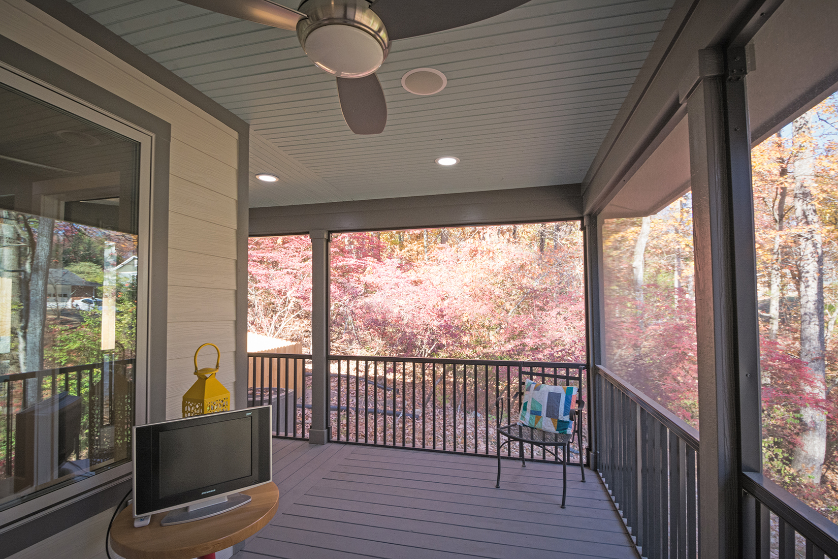
These layouts work great in areas where the weather is pleasant many days out of the year and insects are not a deterrent to opening up your home to the outdoors.  If the latter is an issue, an economical way to create a great outdoor space is through the addition of a screened porch.  

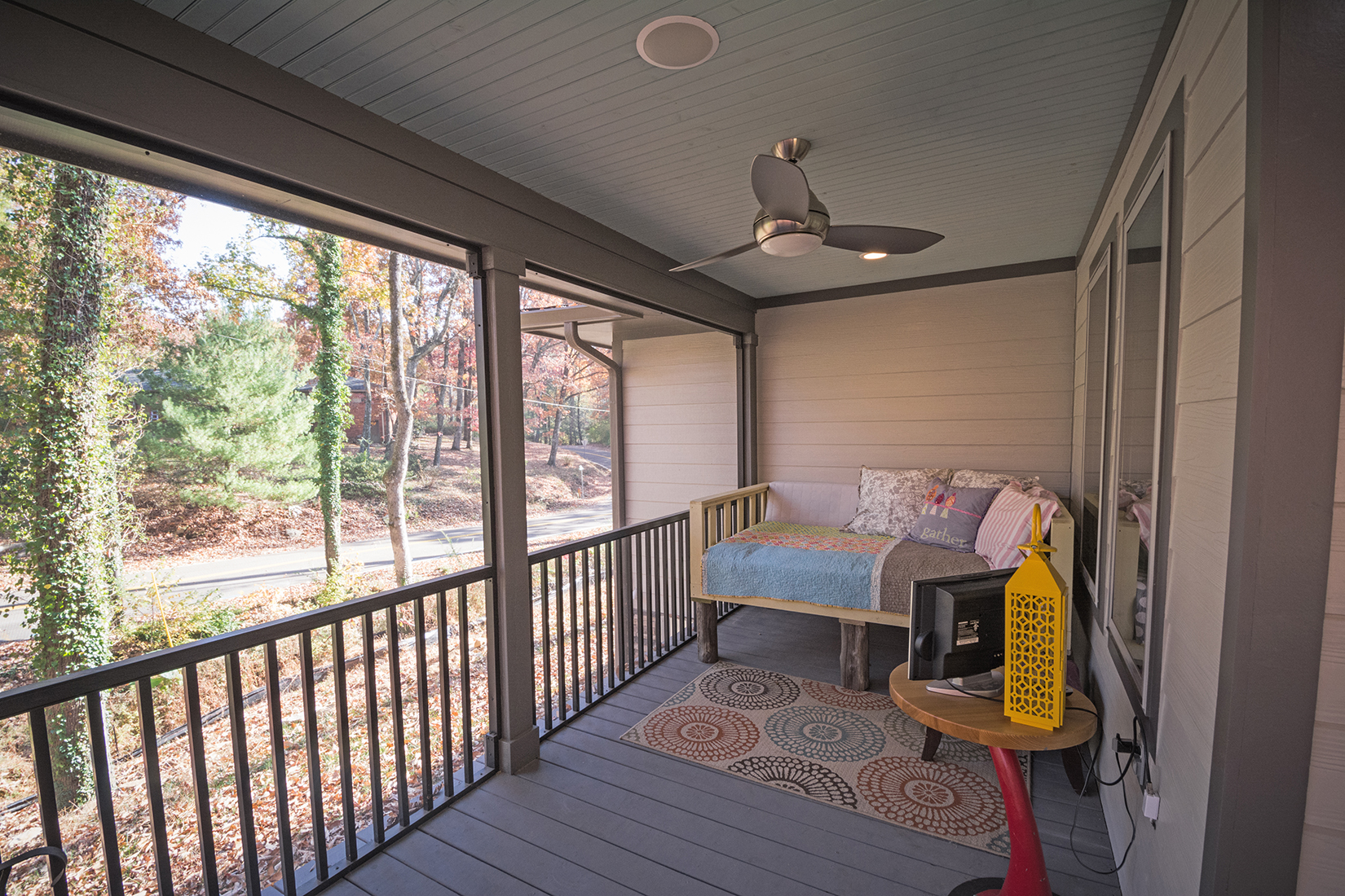
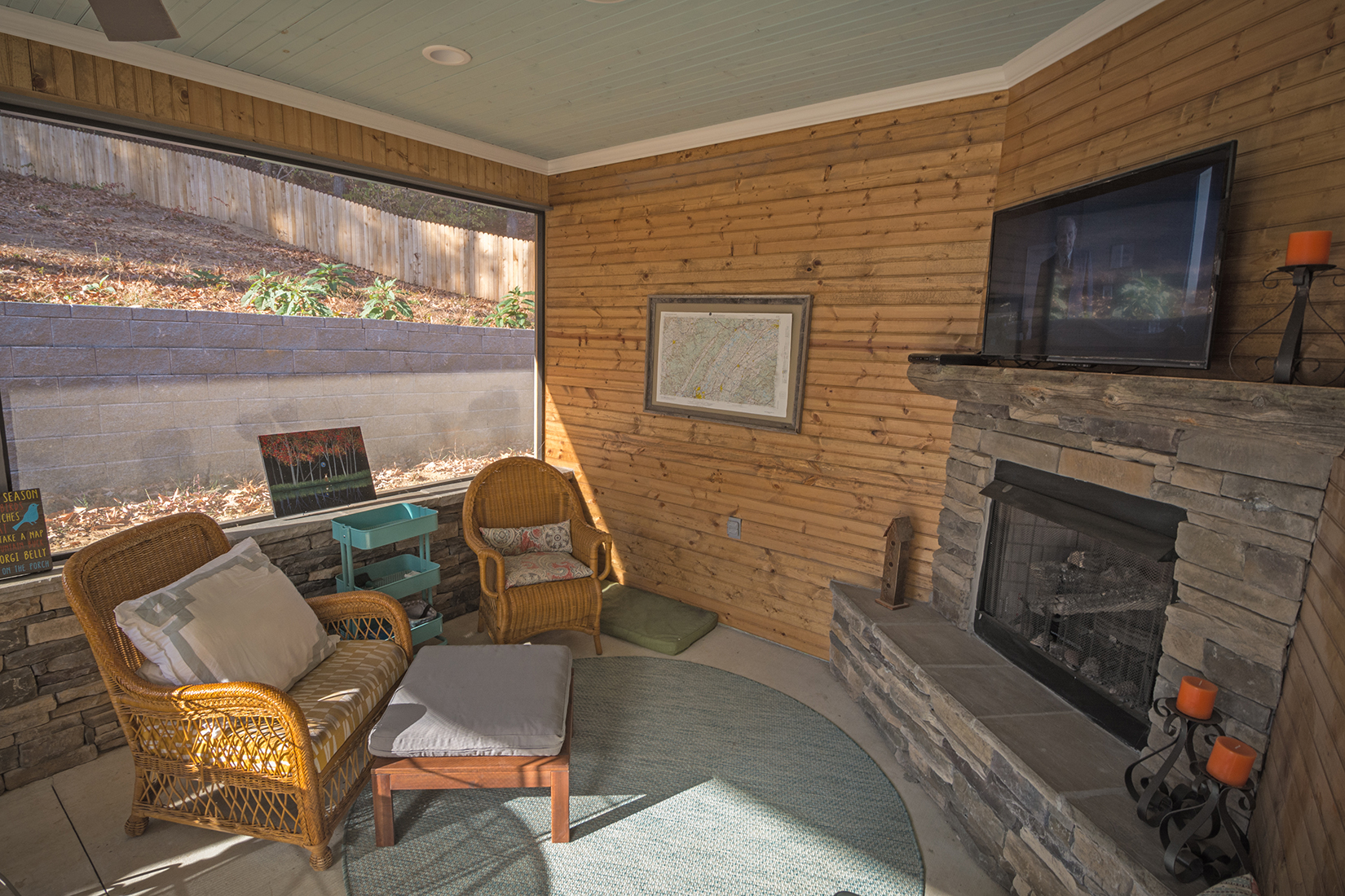
For the project below, we helped our client take advantage of front and side views with a private porch off of the master bedroom.  The back yard is accessible through the screened porch off the open concept living/dining/kitchen.  In warmer climates, this is a great way to save on heating/cooling in the spring and fall, while keeping your home free of unwanted pests! 
Another great way to enjoy the outdoors in your home year round is through the addition of a sunroom.  These can be versatile through the use of a mini-split heating/cooling system so they are usable in the hot/cold months.  These systems are independent from the main HVAC within the rest of your home - so you are only using energy to create a comfortable space when you need it.  

An important factor we always take into consideration is the site and orientation of, not only the indoor/outdoor spaces, but all rooms within the house.  This allows us to utilize passive energy saving strategies that are designed into the home from the beginning, creating the most "bang for your buck" and allowing spaces to be used to their full potential year round.  

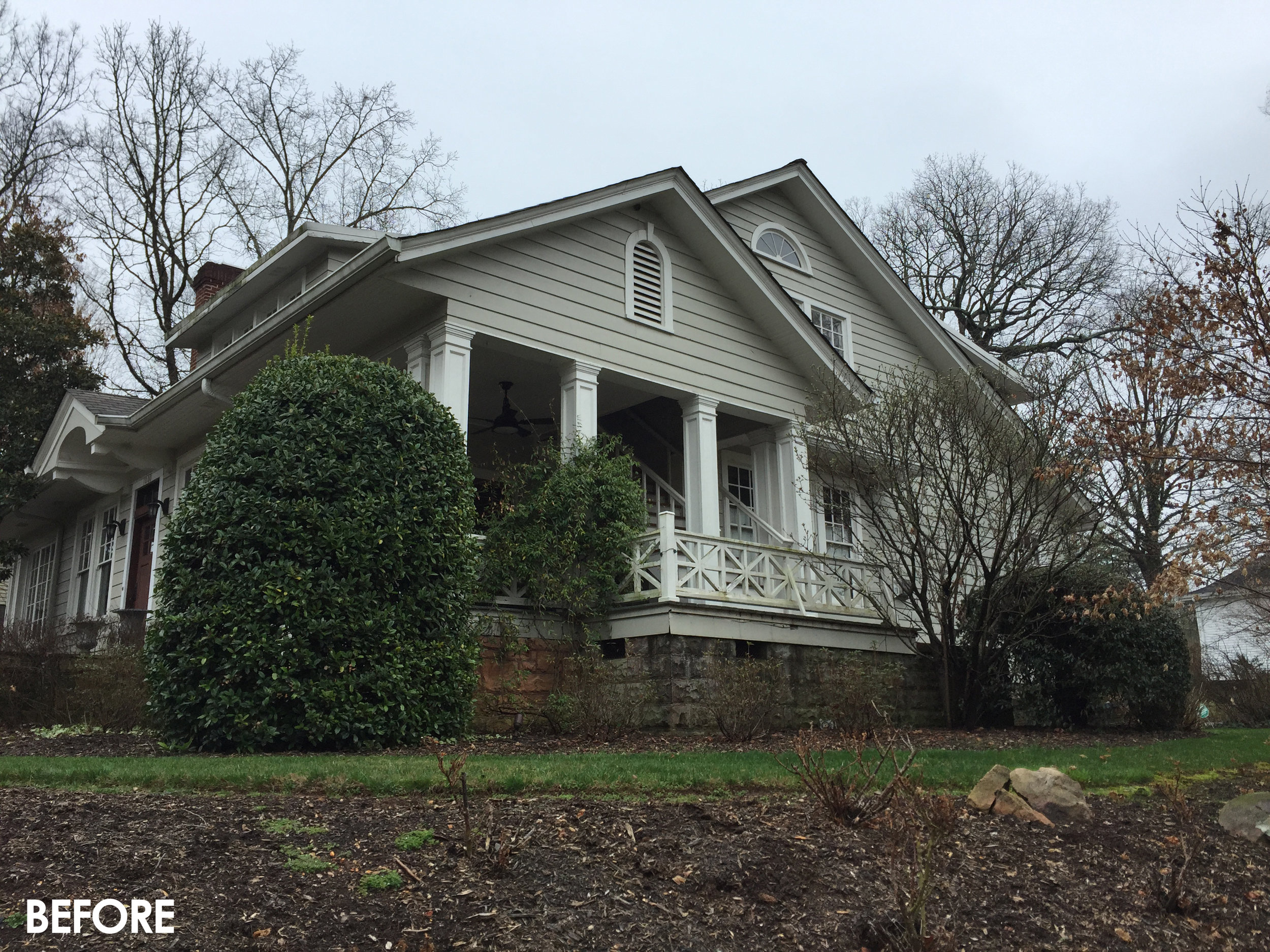
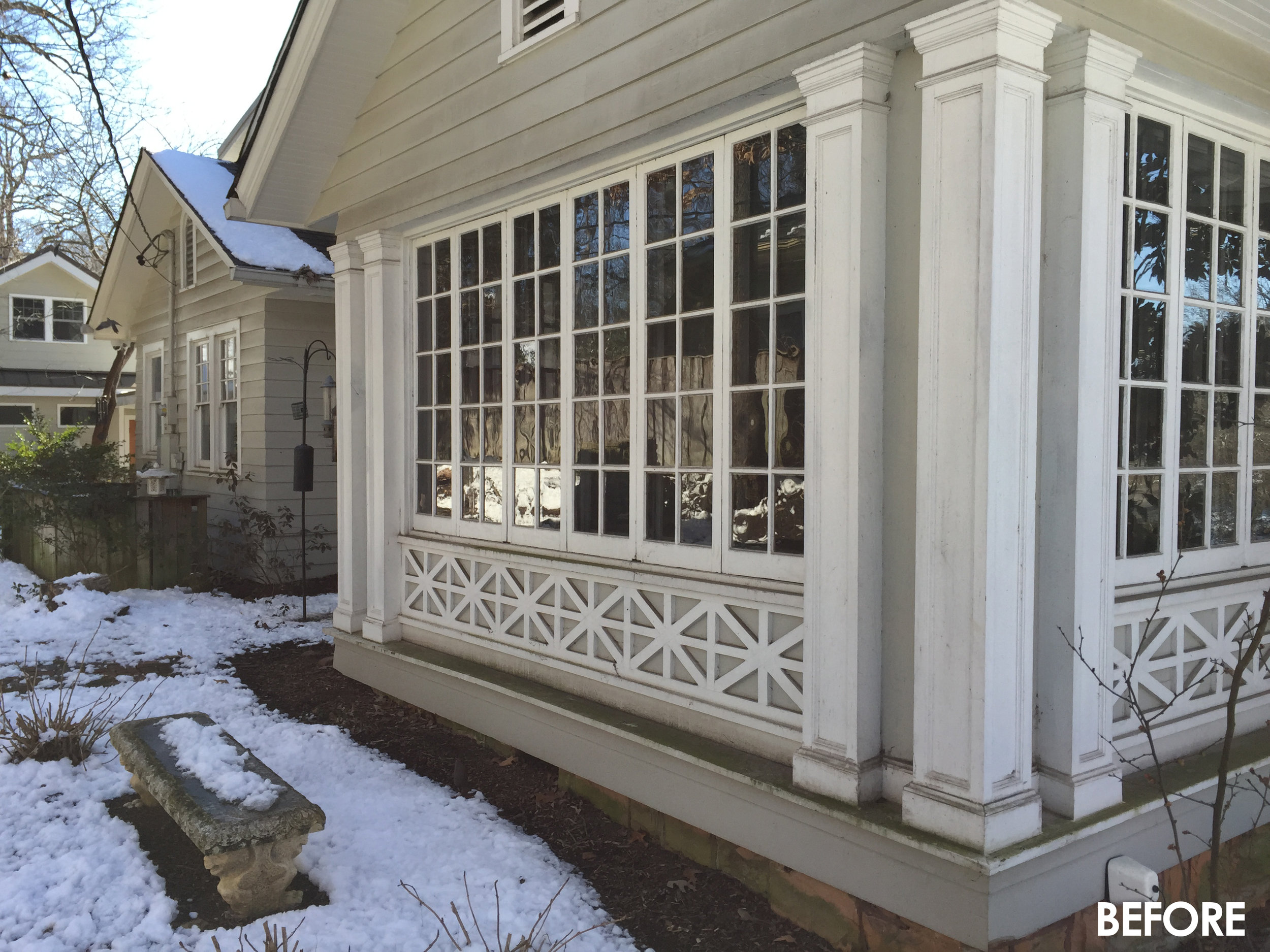
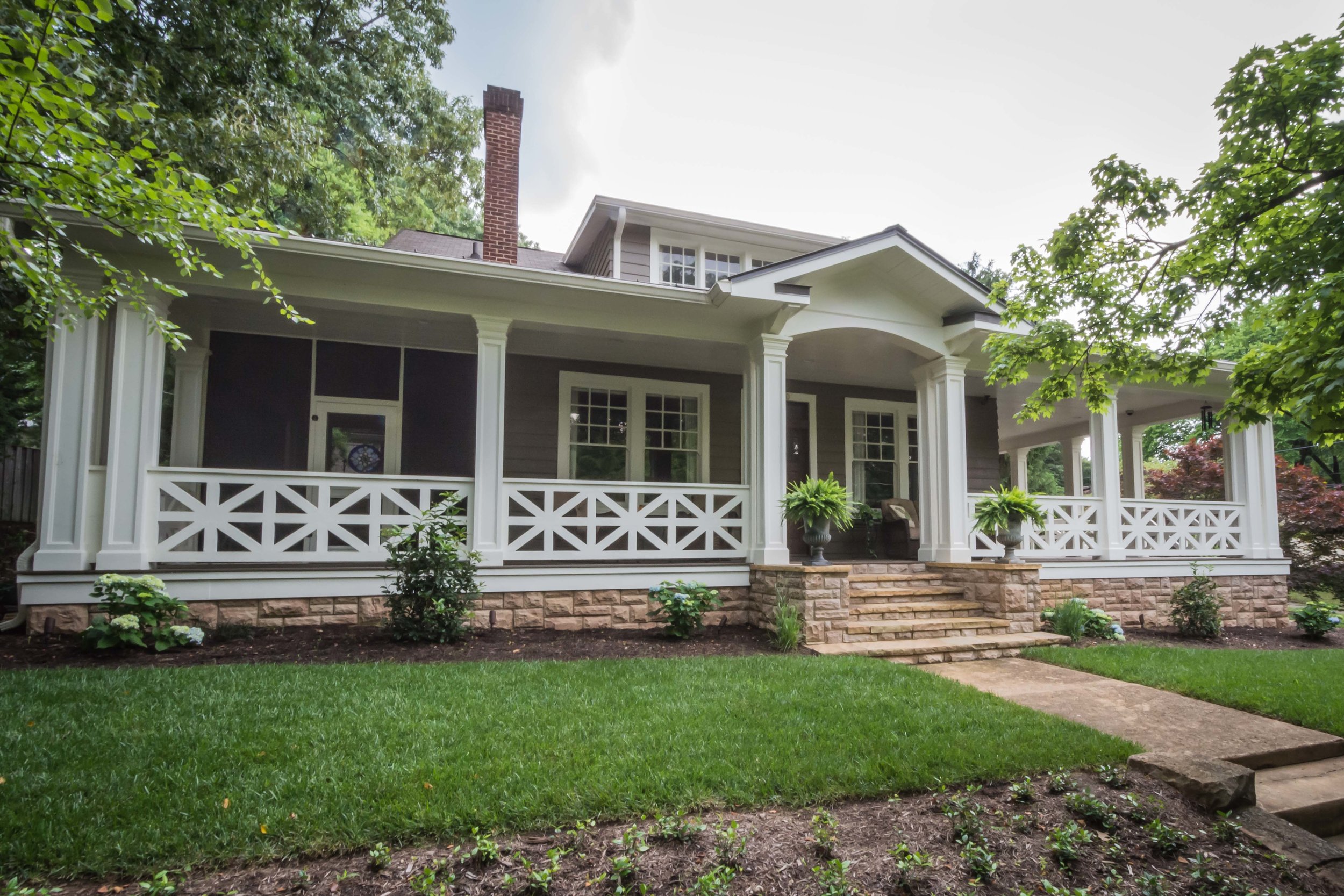
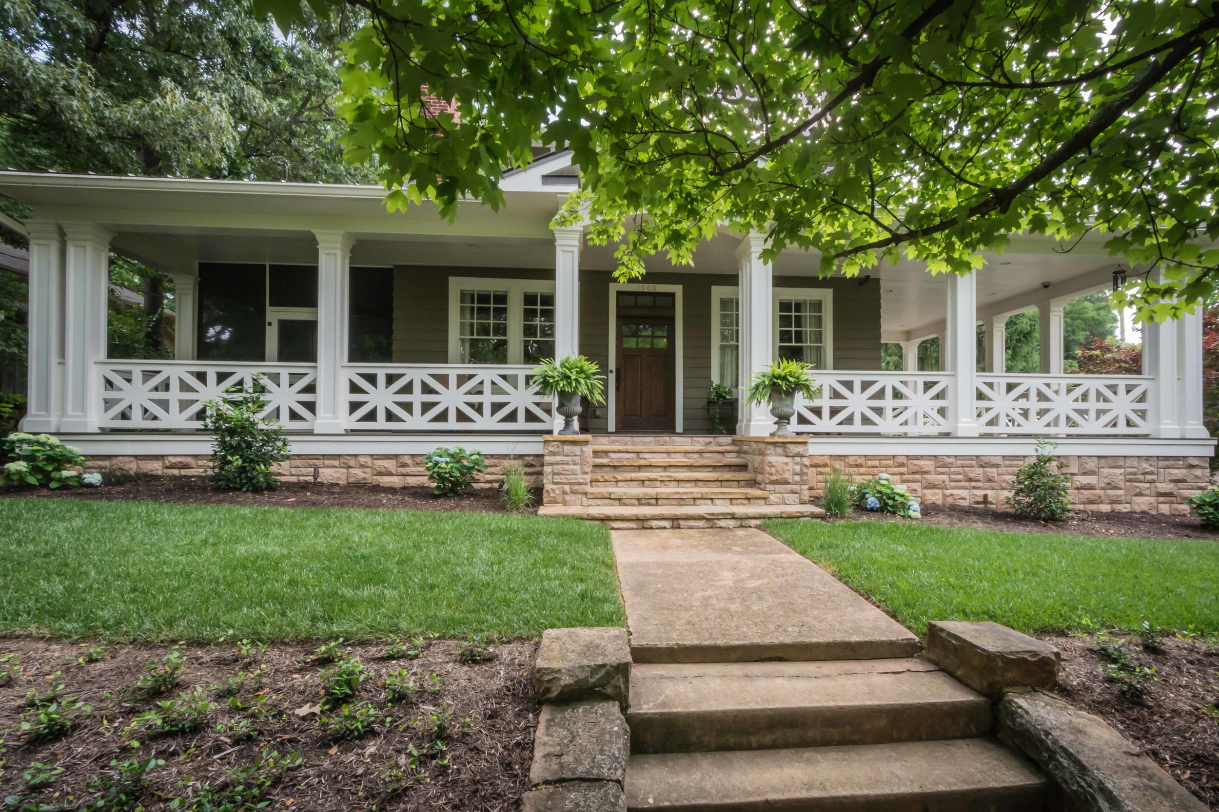
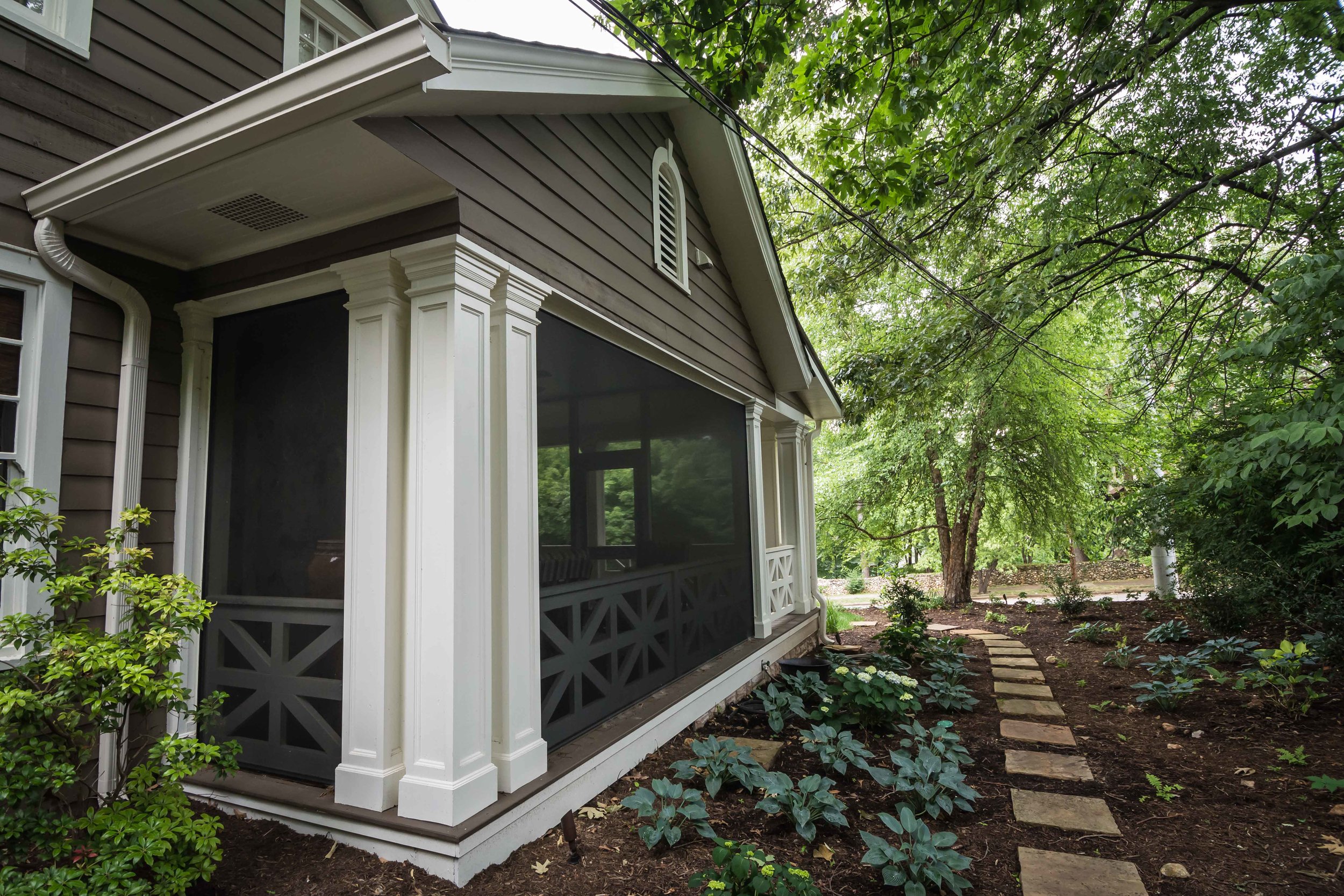
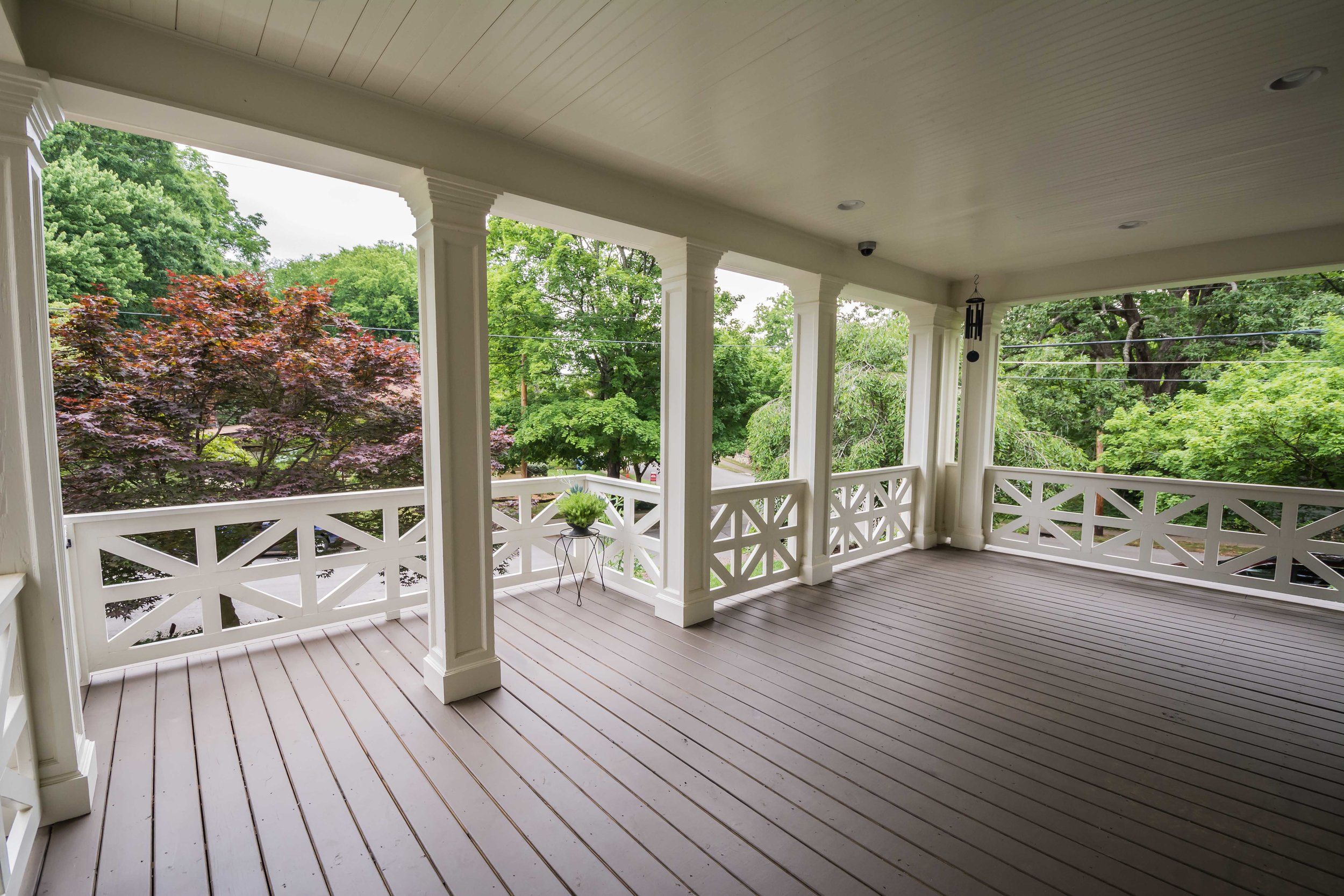
For the renovation above we created two useful outdoor spaces, a screened porch at the more private side of the house and a new front porch that extends into the existing side porch and enhances curb appeal. 

If you're overwhelmed with the possibilities, an architect can help to prioritize your needs and make sure your investment is designed to not only enhance the beauty of your home, but provide the most functional spaces for your family and lifestyle.  

Creating Flexible & Timeless Interiors

Lately, I've had clients ask me about a design "rule" they've heard and wanted to know my opinion as to whether or not it rang true.  The rule that "you have to redecorate every 7 years" is one that I think is outdated and should not apply to a well designed room.  Not only is it not friendly on the wallet, but it implies that a room remains stagnant for those 7 years and who wouldn't get bored in that time frame?!

My answer to clients is this - we are designing with flexibility and timelessness in mind.  Why not create a space that can shift with your lifestyle, mood or the seasons?  Not only does this allow you to follow trends that speak to you, but it creates an evolving space that is unique and adaptable.  

So how do we accomplish this?  It starts with using classic elements to create a backdrop that will withstand and complement current trends and multiple design styles.  


The simplistic, clean-lined architecture of this space creates an environment that supports multiple design styles - the exposed trusses and vaulted ceilings call to farmhouse feel, yet the white paint, trim and light fixtures mix in a modern element.  Neutral white cabinets with a warm wood detail on the hood reinforce this juxtaposition.  With this backdrop - rustic, farmhouse style furniture would fit in as easily as minimalistic modern.  

Here the design creates a welcoming, cozy feel by combining a sofa and rug with a traditional, feminine style with more rustic and masculine tables and leather chairs.  The best part?  Items like pillows, throw blankets, artwork and table top accessories are the easiest items to change out and store when transitioning into a new look or season.  

Photo1-Edit.jpg

To take it a step further, switching out items like side tables, table lamps and chair cushions are also easy adjustments to freshen up the look.  

Furniture.jpg

Don't forget you can repurpose items to another room, or store them to bring back out when the time is right.  Sometimes it's hard to find the item you're looking for so if you see something that strikes your eye - buy it with the idea that items can be shifted and moved when the mood strikes!


Here are some other interior spaces we love that maintain a classic look and are ready to shift with the trends and seasons.  

From warm fall colors to bright and airy spring with a touch of contemporary. 

From a white and green bright color palette to a burgundy, grey and black color scheme with a hint of drama. 

LMS Greenhouse

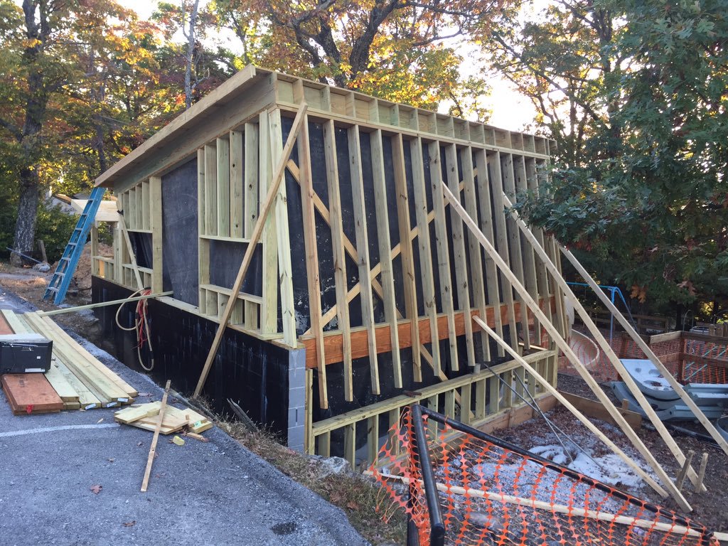
This is a project that we've been working on for a little while, but have wanted to keep the lid on it until now. The Garden Club of Lookout Mountain approached us this summer to design a greenhouse for one of the science teachers at Lookout Mountain Elementary School. The greenhouse will be a gathering space for both teaching and experimenting, but most importantly a thriving environment for plant life!

In the hot summer months, recycled operable windows under the south facing "sun sail" and high windows on the north side can be opened to mitigate the heat as much as possible.